Would a quick estimate help?

When air is visibly bad, the idea of cleaner generation becomes personal.
Air quality snapshots (major cities)
These charts use the World Health Organization Ambient Air Quality Database (version 6.1, released 31 January 2024). Each chart shows the latest available city averages for: fine particle pollution smaller than 2.5 micrometers and nitrogen dioxide. Data snapshot date in this repository: 2026-01-04.
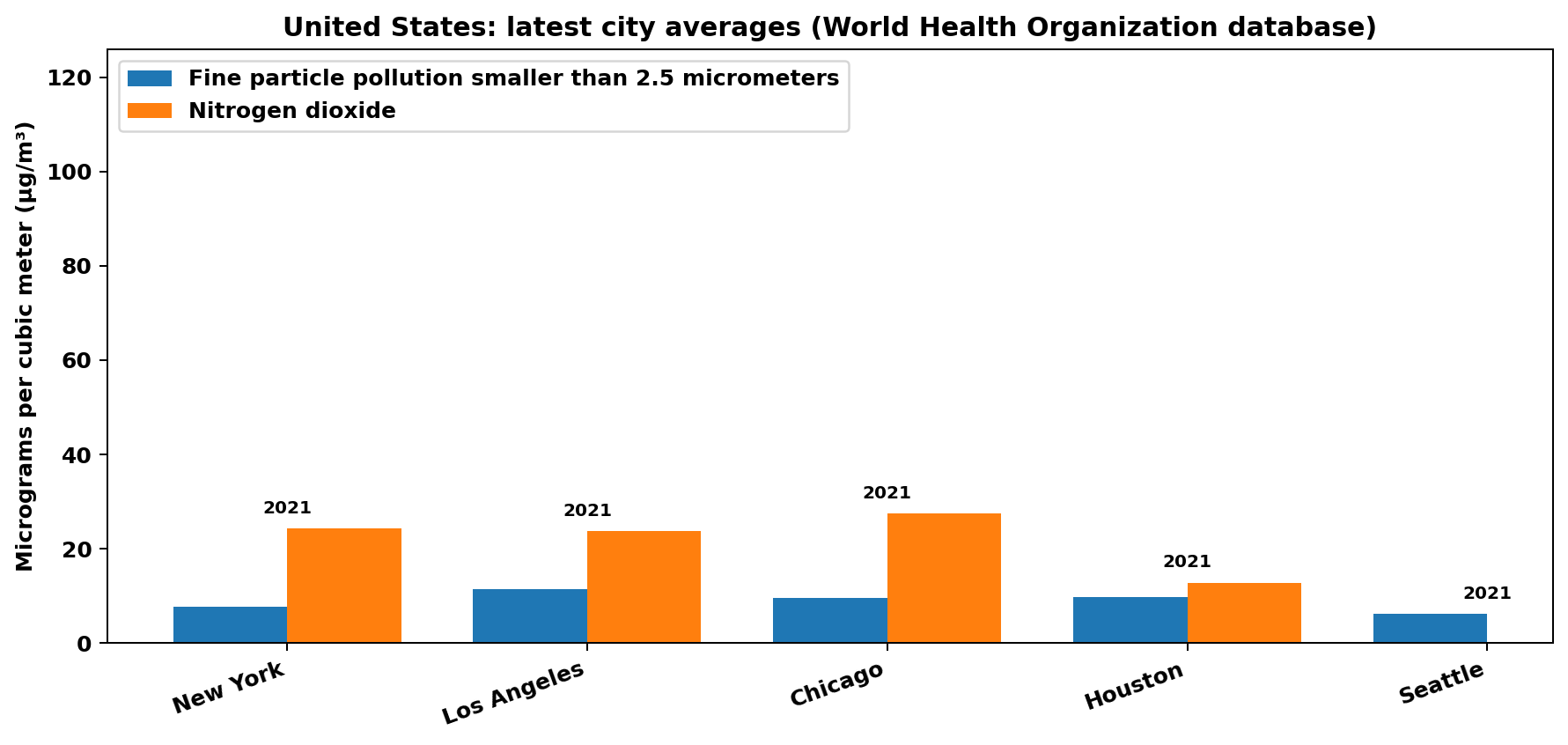
United States: New York, Los Angeles, Chicago, Houston, Phoenix.
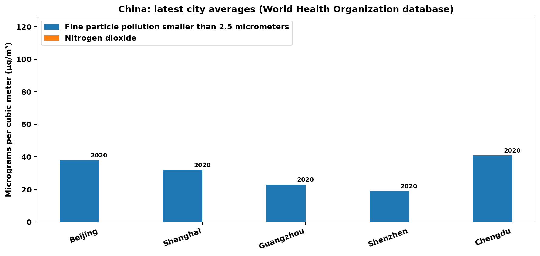
China: Beijing, Shanghai, Guangzhou, Shenzhen, Chengdu.
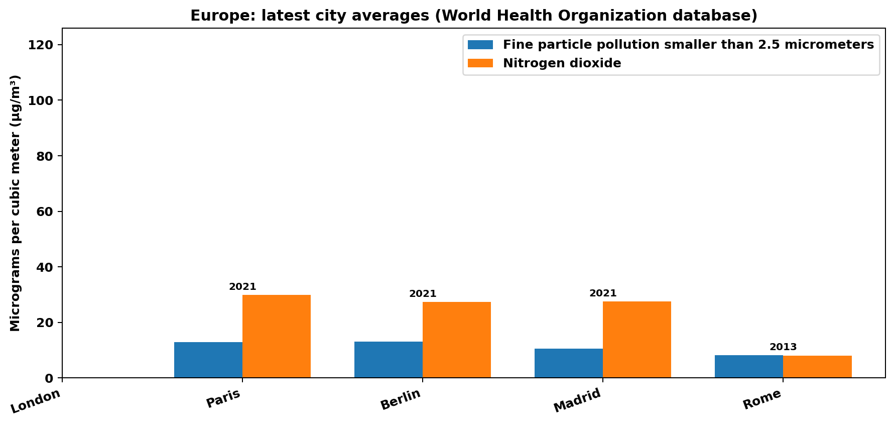
Europe: London, Paris, Berlin, Madrid, Rome.
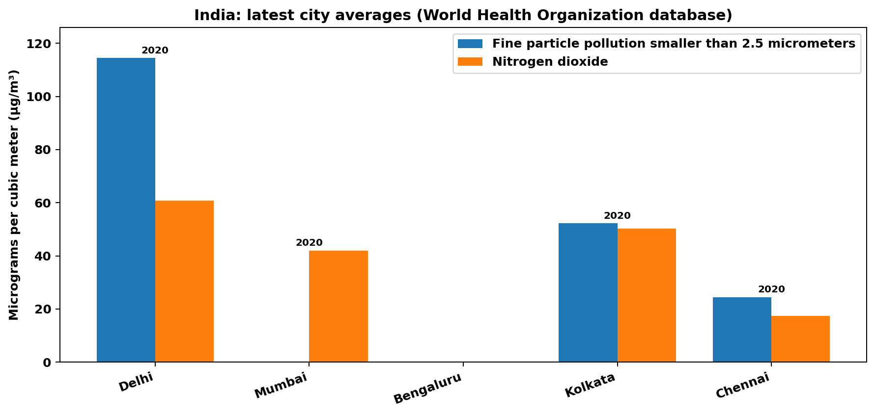
India: Delhi, Mumbai, Bengaluru, Kolkata, Chennai.
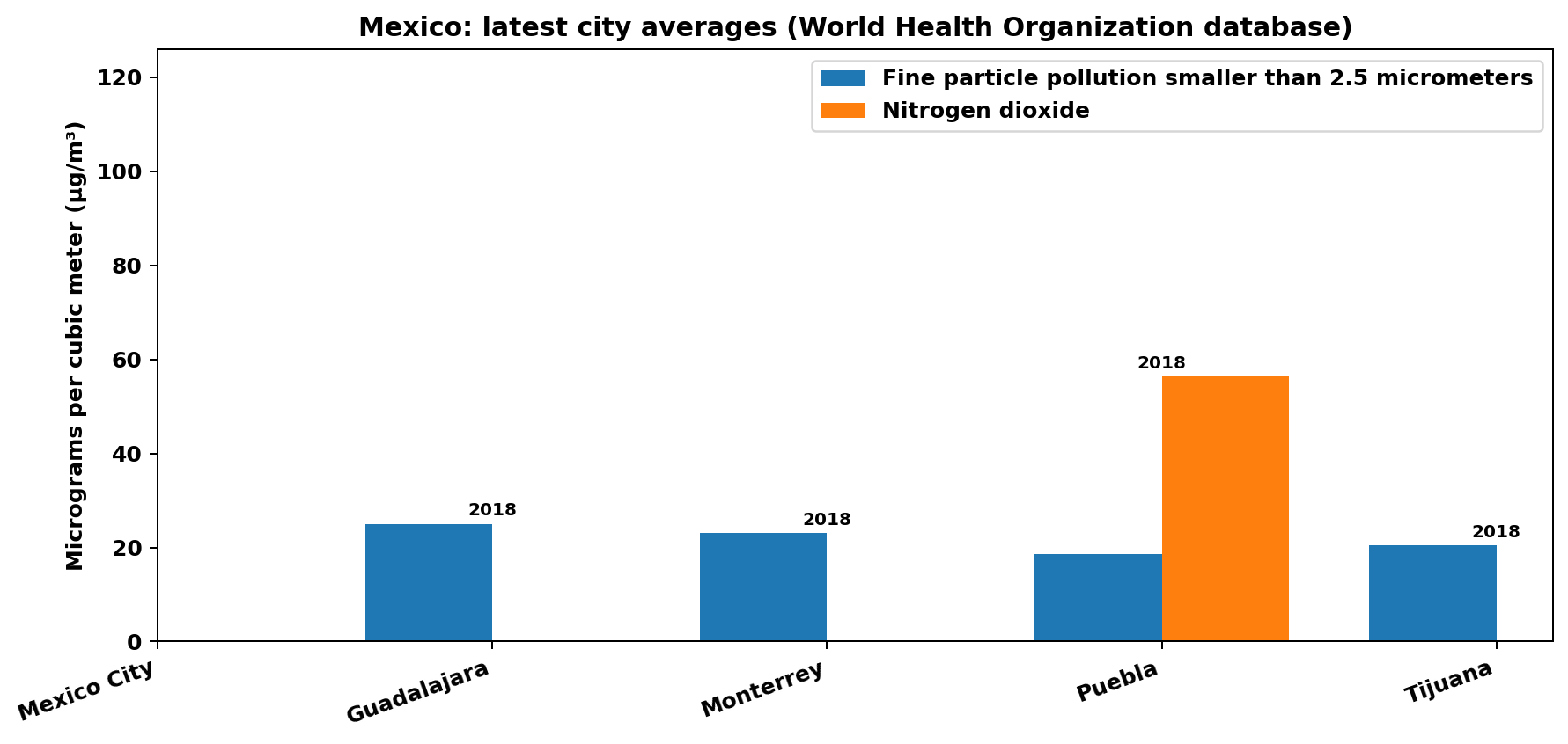
Mexico: Mexico City, Guadalajara, Monterrey, Puebla, Tijuana.
Units: micrograms per cubic meter (µg/m³). All five charts use the same vertical scale so you can compare regions directly. The year printed above each city is the latest year available for that city in the database. City naming varies by country; values represent city-level averages, not a single monitor.
Energy mix: electricity from fossil fuels and solar power
These charts come from the Our World in Data Energy dataset. Each chart shows two lines: electricity from fossil fuels and electricity from solar power, measured in terawatt-hours. All five charts use the same vertical scale so you can compare countries directly. Data snapshot date in this repository: 2026-01-04.
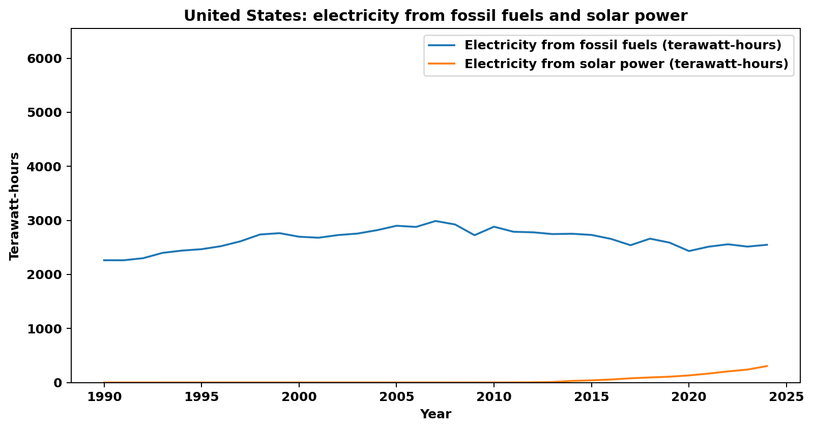
United States (1990–2024).
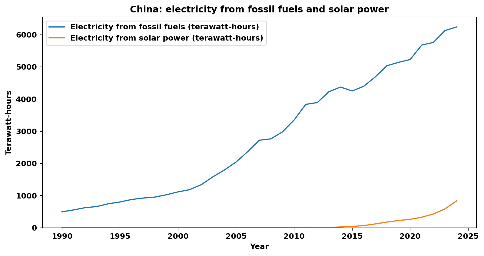
China (1990–2024).
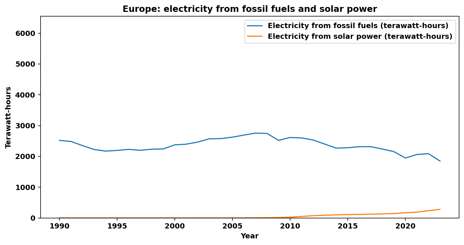
Europe (1990–2024).
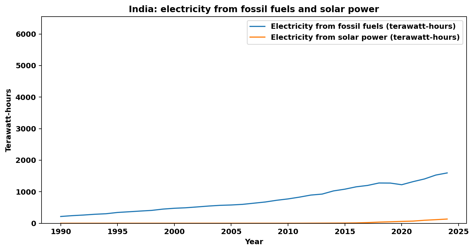
India (1990–2024).
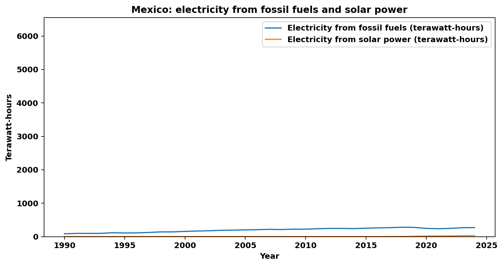
Mexico (1990–2024).